


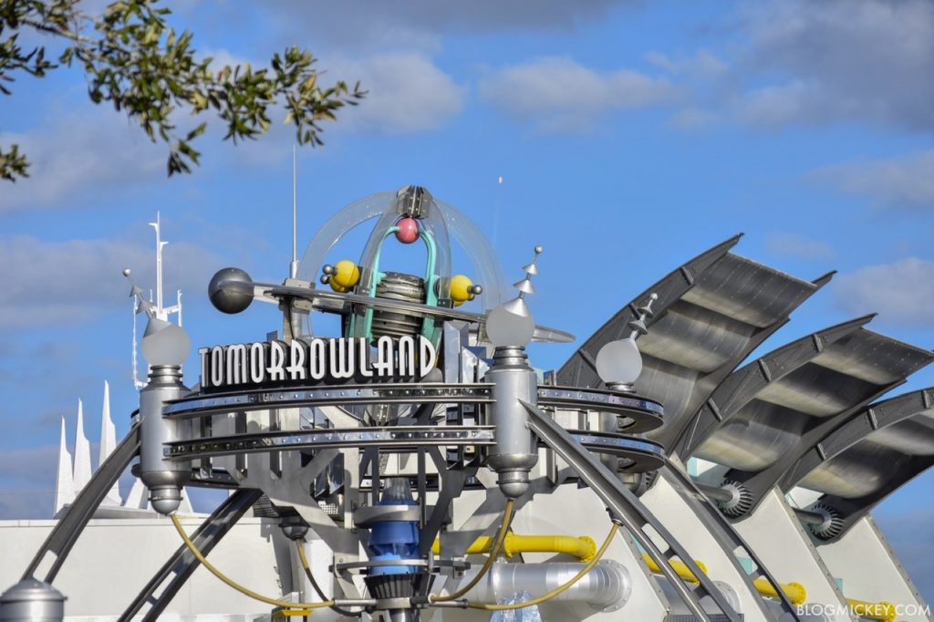
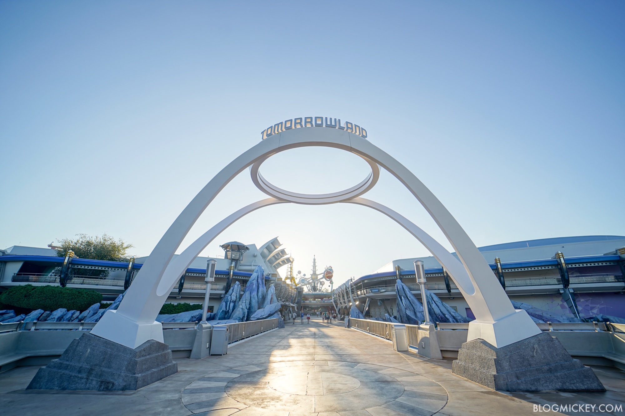
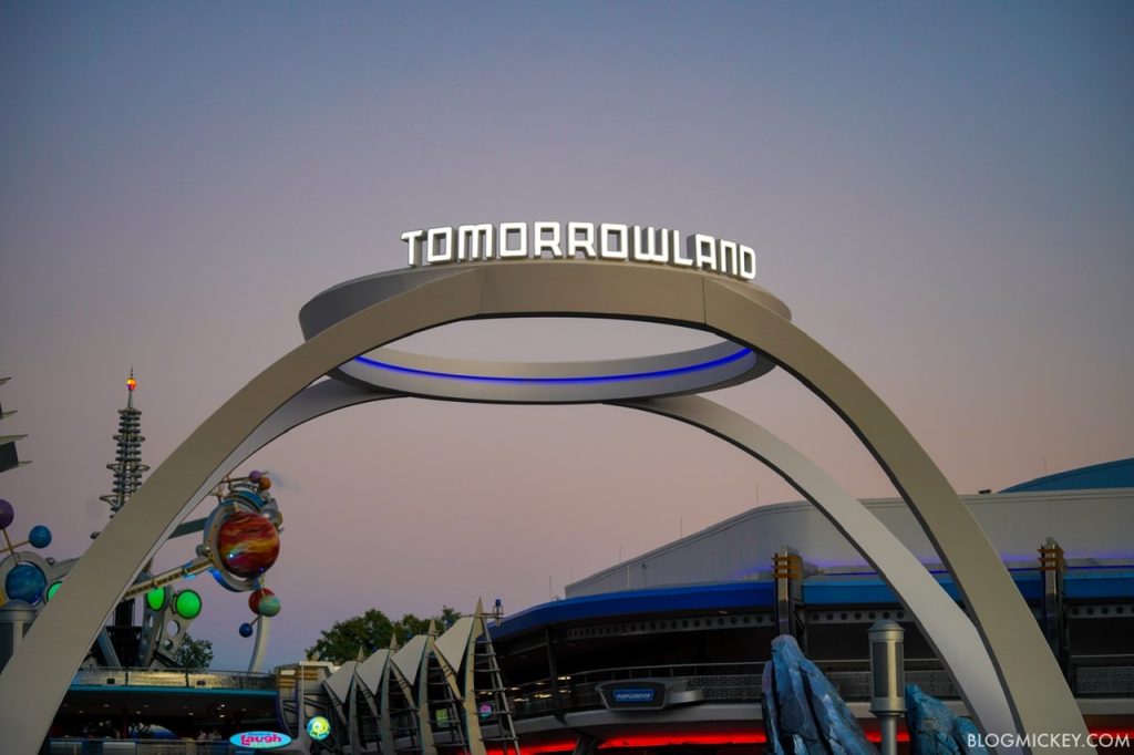
After being removed in July, Tomorrowland now has an entrance sign again at Magic Kingdom. The new Tomorrowland sign was installed overnight and features an all-new look. Gone are the days of the 90’s steam punk design, replaced by a more modern, minimalist design. Here’s a look back at the old design, with the SpaceX Falcon 9 launch in the distance.
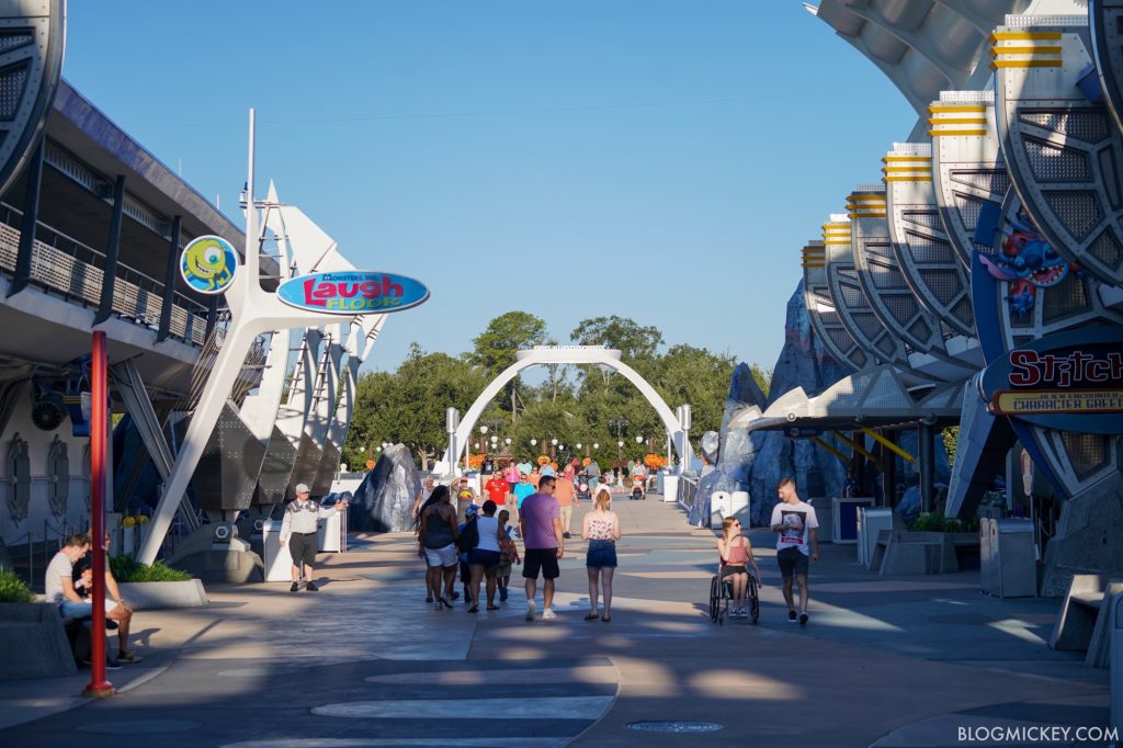
Of course, the look isn’t new for Tomorrowland signs, with the most recent replacement at Monsters Inc Laugh Floor also getting a minimalistic look.
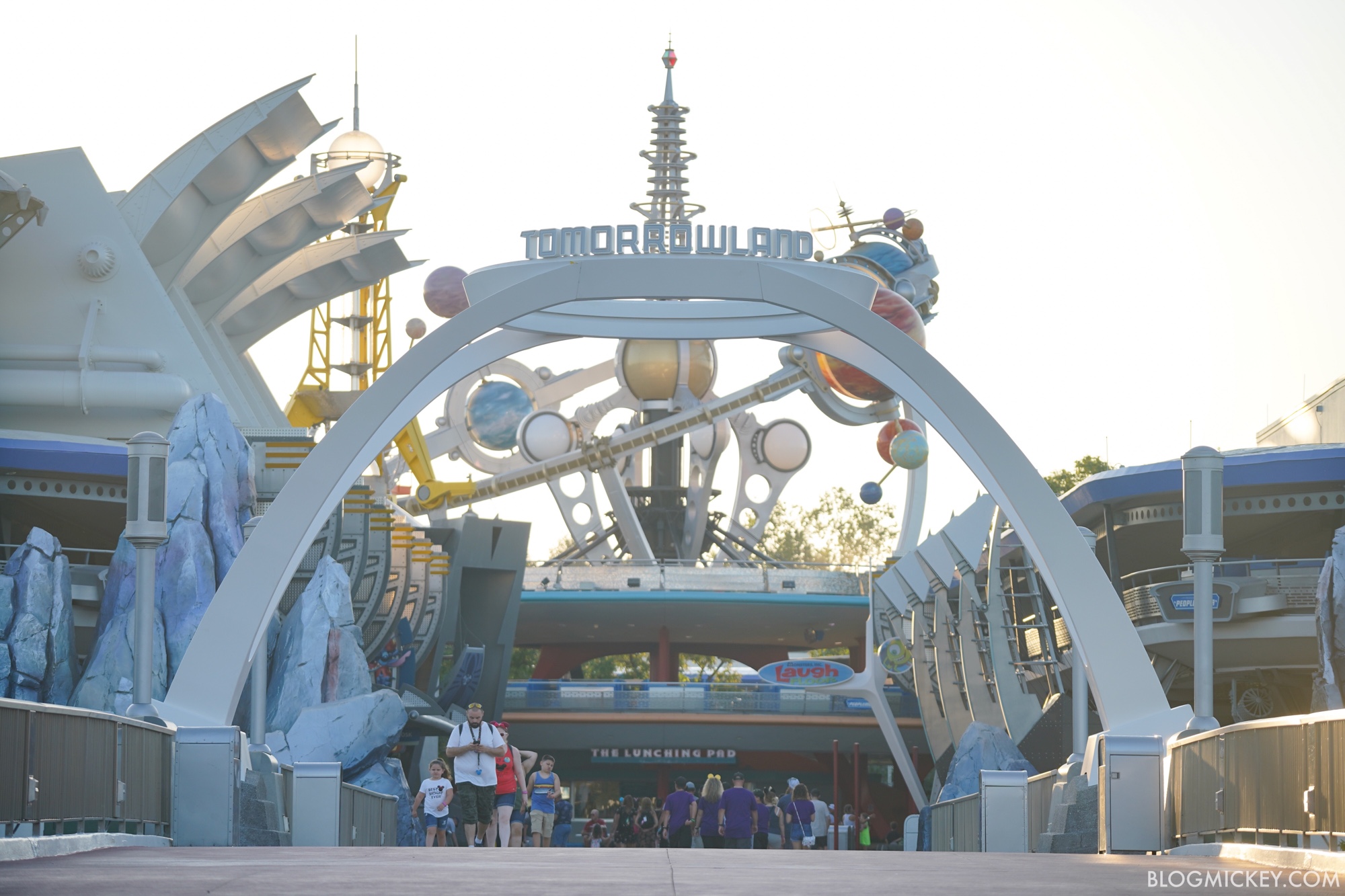
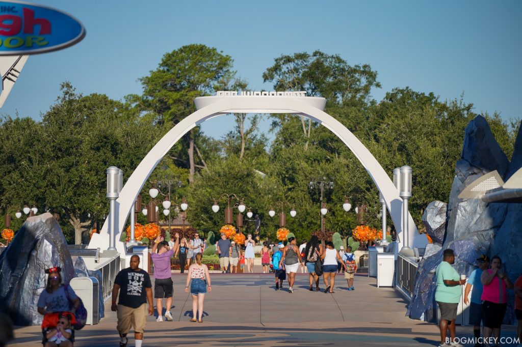
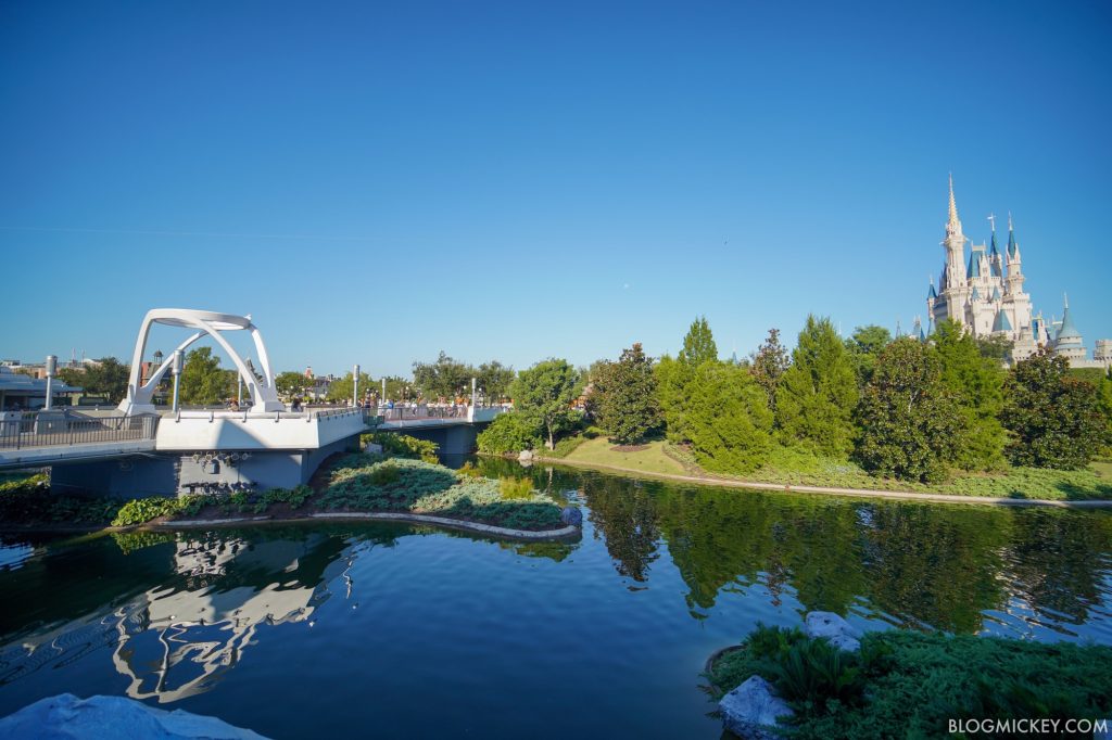
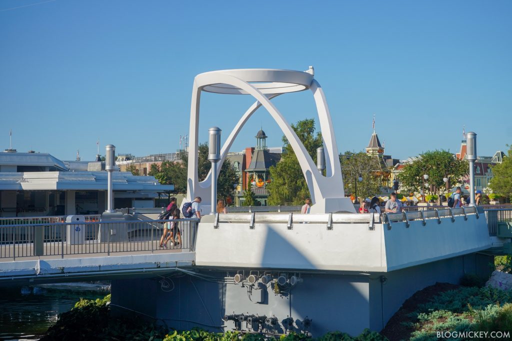
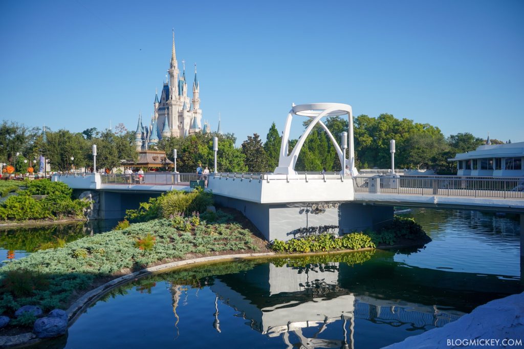
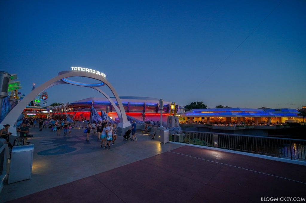
Here’s a look at the new Tomorrowland entrance sign!
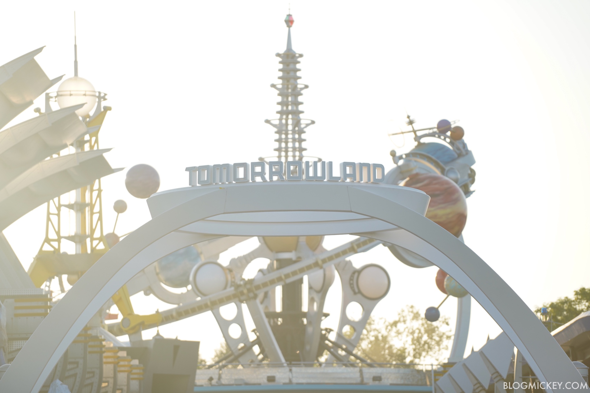
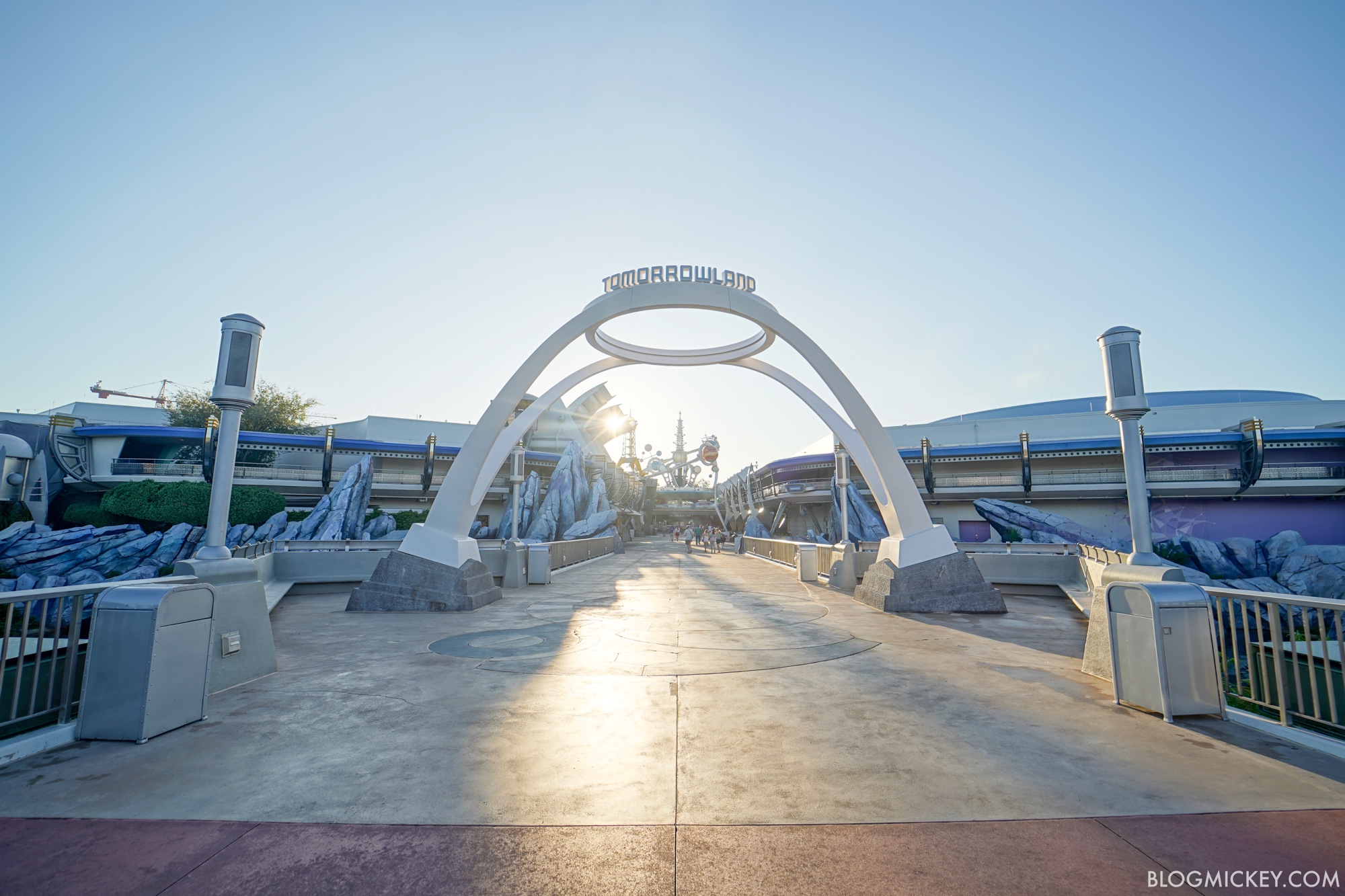
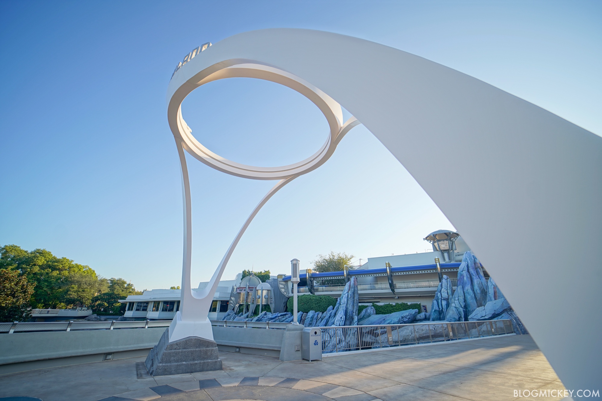
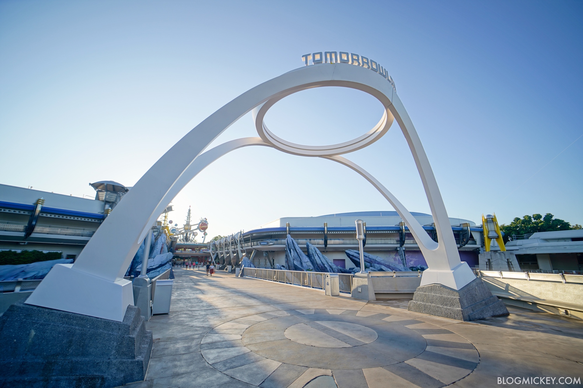
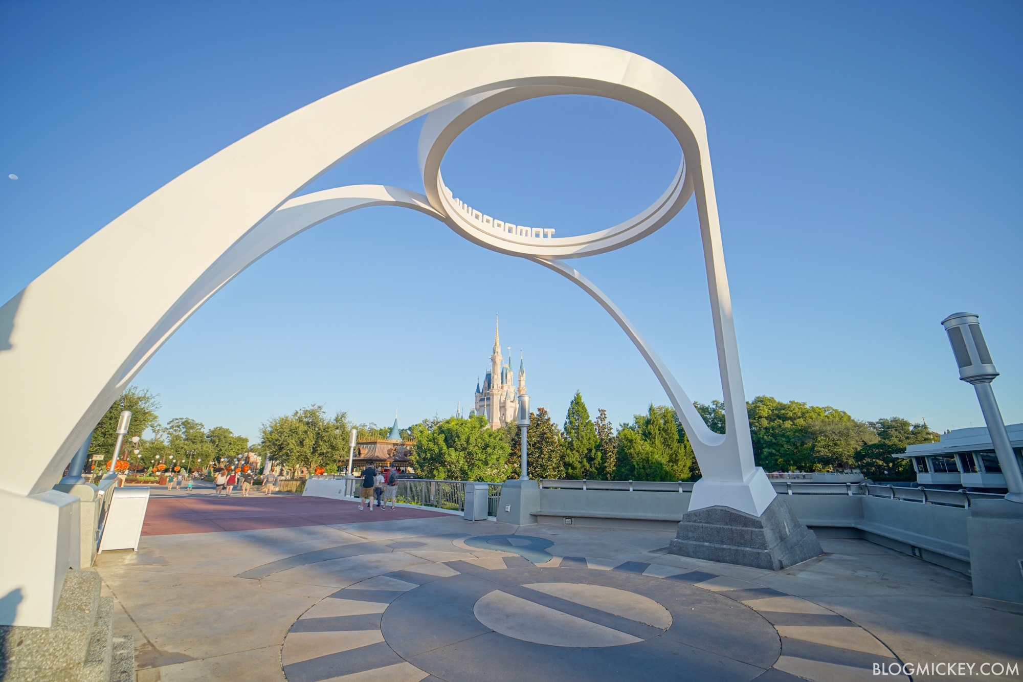
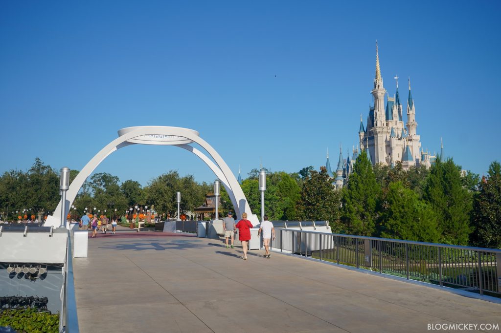
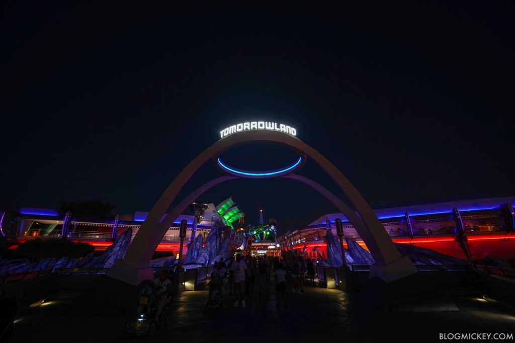
Here’s a look at the sign from inside Tomorrowland, looking back towards it.

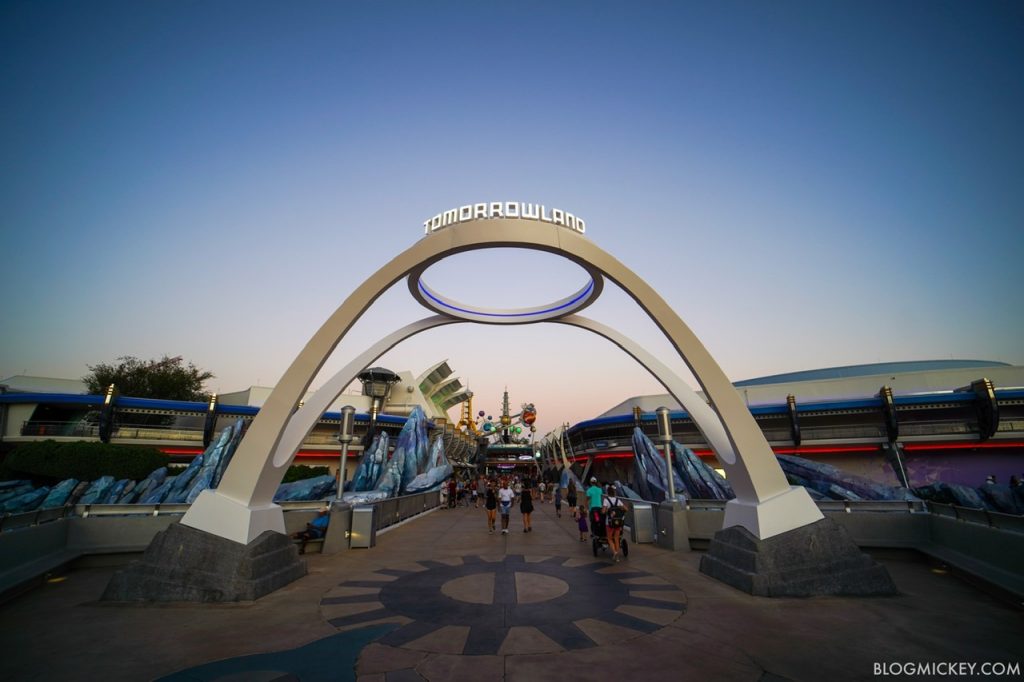
After being dark the first evening on the job, nighttime lighting has finally been turned on! Here’s a look.
As always, keep checking back with us here at BlogMickey.com for the latest photos and news from around the Disney Parks!
Kind of ugly … no imagination put into it.
I actually like the old look better….the new arch is too plain and boring for photo ops in my opinion.
I like it.
Old one was a jumbled mess.
[…] Tomorrowland in het Magic Kingdom heeft een nieuwe entree. Blog Mickey nam een kijkje. […]
Doesn’t have the same retro futuristic feel to it that the rest of Tomorrowland has, rather disappointing.
It’s the beginning of the overhaul. Lol. Everything will match in the coming months.
I Don’t agree with all of you,
It’s that the last sign was so ugly.